

Baymard Institute’s 2026 benchmark shows that only 48% of leading US and European desktop ecommerce sites offer a decent or good product page experience, and only 38% of mobile sites do. Ecommerce product page optimization closes that gap by removing the small frictions that push shoppers away before they buy. This guide walks US brands through the fixes that matter most.
What ecommerce product page optimization means
Ecommerce product page optimization is the process of improving every element of a product page so that more visitors understand the product, trust the brand, and complete the purchase. It covers images, copy, pricing, delivery details, reviews, page speed and mobile usability.
It differs from broad site optimization because it focuses on the single page where shoppers make their decision. A US brand can start with one bestselling product and then apply the same approach across the catalog.
Why the product page decides the sale
A shopper who reaches a product page has already shown interest. What happens next depends on whether the page answers their questions quickly. Baymard’s testing found that participants often abandoned products that suited them, and the cause was usability problems that brands could resolve.
That makes the page a practical place to improve results without buying more traffic.
Get the page layout and content right
Make the product clear on the first screen
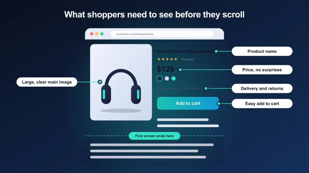
Shoppers should understand what the product is, who it is for, and what it costs without scrolling. Place the product name, price, main image and add to cart button together near the top. Keep promotional banners and pop-ups from pushing these elements down, especially on mobile screens.
Show every product image in one gallery
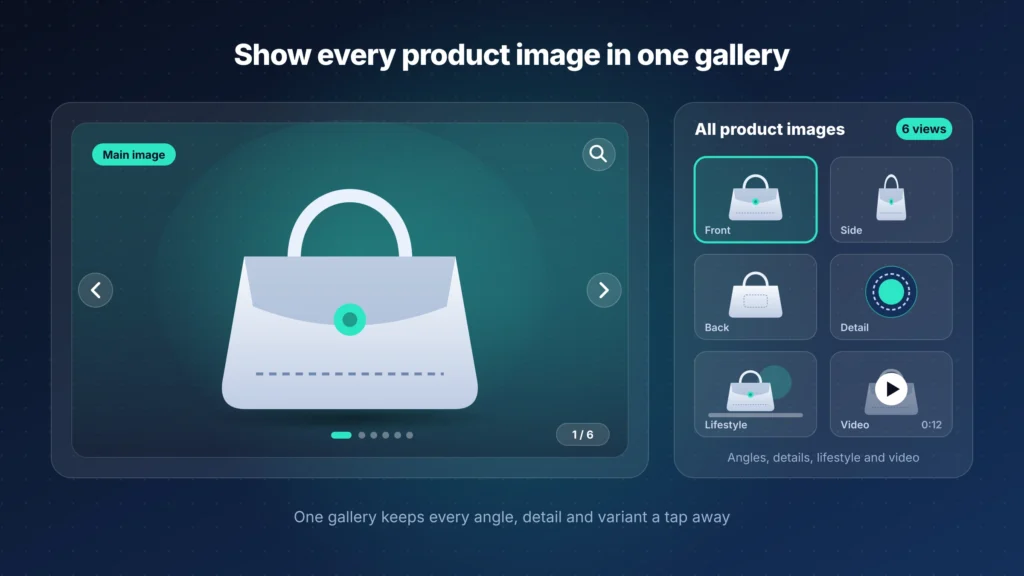
Shoppers cannot touch a product, so images do the work of a store visit. Baymard’s guidelines recommend keeping all product images in one central gallery so that shoppers do not miss any. Baymard’s research also notes that shoppers often want more images than sites provide.
Add several angles, a zoom option and at least one image that shows the product in use.
Write product copy that answers real questions
Good copy replies to the questions a shopper would ask in a store. List materials, sizes, ingredients or specifications in a format that is easy to scan. Write benefits in plain language and avoid claims you cannot support.
A clear brand message makes this easier, because every description then carries the same voice and promise. Our guide on how to build a brand positioning strategy explains how to define that message.
Build trust with delivery details and reviews
Put shipping and returns where shoppers look first
Baymard lists shipping, returns and gifting among the product page areas where ecommerce sites commonly fall short. Shoppers want to know the delivery cost and the return window before they commit. State both near the add to cart button and link to the full policy for details. Hiding these terms in a footer link forces shoppers to leave the page to find them.
Use reviews to build trust
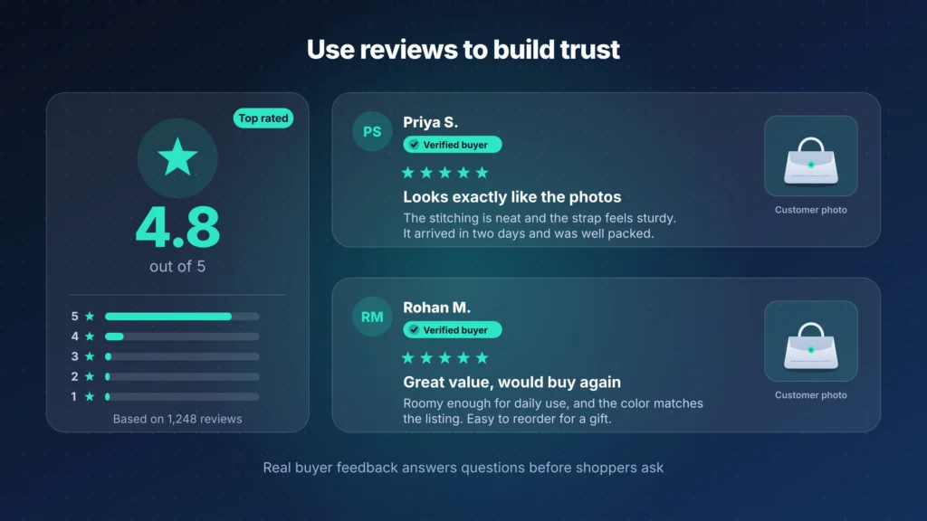
Baymard also lists user reviews among the product page topics where sites often miss best practices. Show the star rating near the product title and place the full reviews further down the page. Let shoppers filter reviews by rating or by the attribute they care about. Include critical reviews as well, and reply to them professionally.
Keep the page fast and keep testing
Keep the page fast and stable
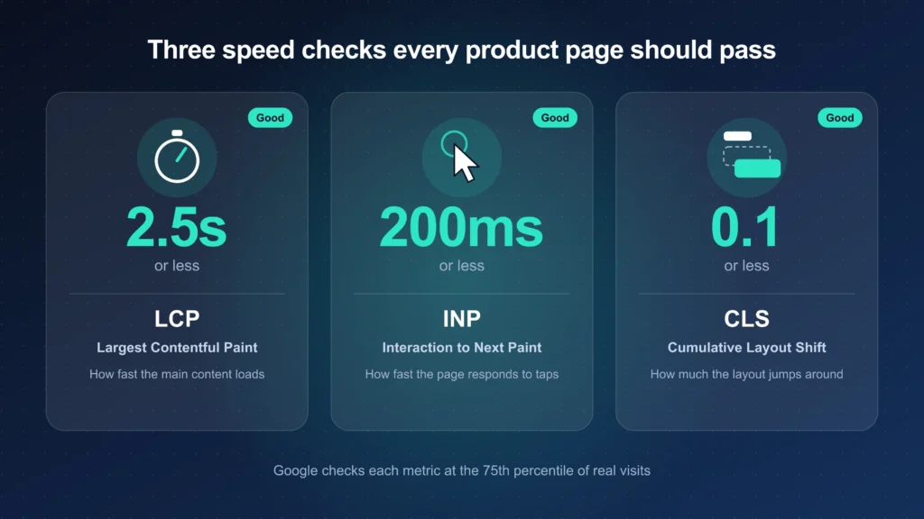
Speed and stability shape how a page feels, and Google measures them through three Core Web Vitals. A good Largest Contentful Paint is 2.5 seconds or less. A good Interaction to Next Paint is 200 milliseconds or less, and a good Cumulative Layout Shift is 0.1 or less.
Google assesses each metric at the 75th percentile of real visits, as Google’s web.dev documentation explains. Compress images, load product galleries efficiently, and reserve space for images so the layout does not jump while the page loads.
Test each change before rolling it out
Best practices give you a starting point, not a guarantee. Change one element at a time, such as the image gallery or the position of the delivery information, and compare results over a set period. Track conversion rate, add to cart rate and bounce rate on each page. Keep the version that performs better for your own shoppers.
Reduce friction at the buying step
Make variant selection effortless
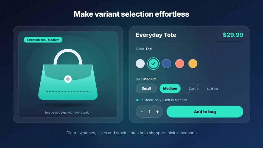
Shoppers choose sizes, colors and options on the product page, and confusion at this step costs sales. Show every option as a clear button or swatch instead of a hidden dropdown. Mark unavailable options plainly and update the main image when a shopper picks a color.
Keep the selected choice visible so that shoppers always know what they are about to buy.
Design the add to cart button for thumbs
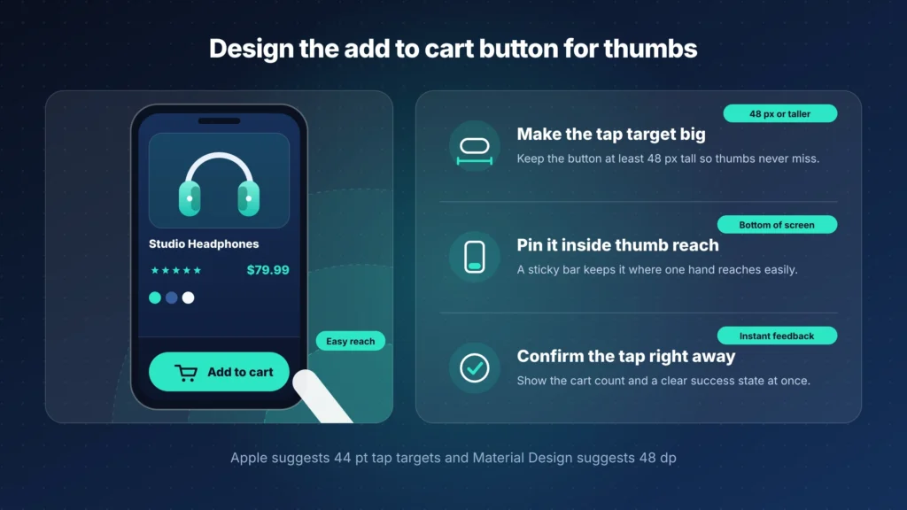
Many shoppers browse with one hand, so the button must be easy to reach. Make it large, give it a contrasting color, and label it with a plain action such as Add to cart. Some brands keep the button visible as the shopper scrolls, which saves effort on long pages. Test this on your own audience before you adopt it.
Add video and proof of the product in use
Video shows how a product moves, fits or works, which still images cannot. Short clips suit most products and load faster than long ones. Customer photos add proof, and placing them beside the reviews lets shoppers see real results. Always get permission before you display a customer’s photo.
Show price, tax and delivery cost early
Shoppers want to know the full cost before they commit. Show the price clearly, mention any free shipping threshold, and give an estimated delivery date near the button. State extra costs on the product page whenever you can, so that nothing surprises the shopper later.
Add trust signals next to the buy button
Trust signals reduce doubt at the moment of decision. Place secure payment icons, a short summary of the return policy and your support contact details near the add to cart button. List the payment methods you accept, including digital wallets if your store supports them. Use only badges and guarantees that your business actually holds.
Support search and measure results
Help search engines understand the page
Shoppers often find product pages through search, so page structure matters. Write a unique title and description for each product, and use one clear H1 with the product name. Add descriptive alt text to every image.
Use Product structured data so that search engines can read price, availability and ratings. Avoid copying manufacturer descriptions, because unique copy sets your page apart.
Common product page mistakes to avoid
- Hiding the price or delivery cost until checkout.
- Using one or two small images for a product that needs several angles.
- Copying supplier descriptions word for word.
- Placing reviews so low on the page that shoppers never find them.
- Letting heavy images or scripts slow the page on mobile.
- Changing several elements at once and losing track of what worked.
Measure the results that matter
Track a few measures for each page and compare them before and after every change.
Metric | What it tells you | When to prioritize it |
|---|---|---|
Product page conversion rate | The share of visitors who buy | Always, as your main success measure |
Add to cart rate | The share of visitors who add the product to the cart | When shoppers show interest but do not buy |
Bounce rate | The share of visitors who leave without any action | When new traffic arrives from ads or social media |
Core Web Vitals | Loading speed, responsiveness and visual stability | After any design or app change |
Return rate | The share of orders sent back | When copy or images may set the wrong expectation |
Product page checklist
- The product name, price, main image and button appear on the first screen
- All product images sit in one gallery, with several angles and zoom
- Variants show as clear buttons or swatches
- Shipping cost, delivery estimate and return window appear near the button
- Reviews are visible, filterable and include critical feedback
- Copy answers the questions shoppers ask in a store
- LCP, INP and CLS meet Google’s good thresholds on mobile
- Each change is tested against a clear metric
Get an expert review of your product pages
Brands that want an outside review can work with the Morphiaas USA agency team.
Frequently Asked Questions
1. What is ecommerce product page optimization?
Ecommerce product page optimization is the process of improving product images, descriptions, pricing, reviews, page speed and layout to provide a better shopping experience and increase conversions.
2. Why is product page optimization important for ecommerce businesses?
It helps businesses build customer trust, reduce shopping friction, answer customer questions and encourage more visitors to complete their purchases.
3. How can I improve my ecommerce product pages?
You can improve product pages by using high-quality images, writing unique product descriptions, displaying customer reviews, providing clear shipping information and optimizing mobile performance.
4. How many images should a product page have?
A product page should have enough high-quality images to show different product angles, important details and the product in use. A central image gallery with zoom functionality can improve the shopping experience.
5. How do customer reviews help increase ecommerce sales?
Customer reviews provide social proof and help potential buyers make informed decisions. Positive and negative reviews also make the brand appear more transparent and trustworthy.
6. How does page speed affect ecommerce product pages?
Slow-loading pages can frustrate shoppers and increase the chances of abandonment. Improving image sizes, reducing unnecessary scripts and optimizing Core Web Vitals can create a smoother experience.
7. What SEO elements should an ecommerce product page include?
An optimized product page should include a unique meta title, meta description, clear H1 heading, descriptive image alt text, original product descriptions and Product structured data.
Conclusion
Ecommerce product page optimization works best as a steady habit rather than a single project. Start with the first screen, the images, the delivery details and the page speed. Measure each change and keep what helps your shoppers decide.
If you want an expert review of your own product pages, the Morphiaas USA team can help you find the next improvement.