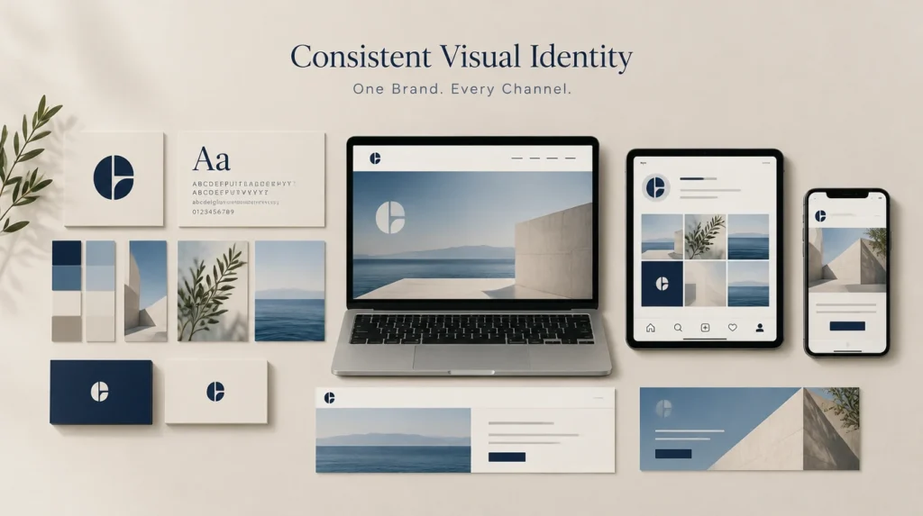
A consistent visual identity is the same core visual system applied everywhere your brand shows up online. About three in four companies have brand guidelines they don’t actually enforce, which is why so many brands’ websites and Instagram feeds look like two different companies. This guide covers what consistency really means, how to build it, and how to hold it across every channel.
Key takeaways
- A consistent visual identity means one core system (logo, color, type, imagery) applied the same way everywhere.
- Consistent brand presentation is tied to a revenue lift of roughly 23%, per Lucidpress survey data.
- Only about 25% of companies with brand guidelines actually enforce them, so most leave that lift on the table.
- Consistency isn’t sameness: tone and format flex per channel, the visual core holds.
- Build it in six steps, then audit every channel on a schedule to catch drift early.
What is a consistent visual identity?
A consistent visual identity is your core visual system, logo, color, typography, and imagery, applied the same way across every place a buyer meets your brand online. It’s what makes your website, your email, and your social feed instantly read as the same company, so recognition builds instead of resetting at each touchpoint.
Consistent doesn’t mean identical, and that trips people up. The format changes from a website header to an Instagram post to an email. The visual core, your colors, your fonts, your logo rules, does not. Visual identity is the fixed system; the channel decides how it’s arranged, not what it’s made of.
Why does visual consistency across channels matter?
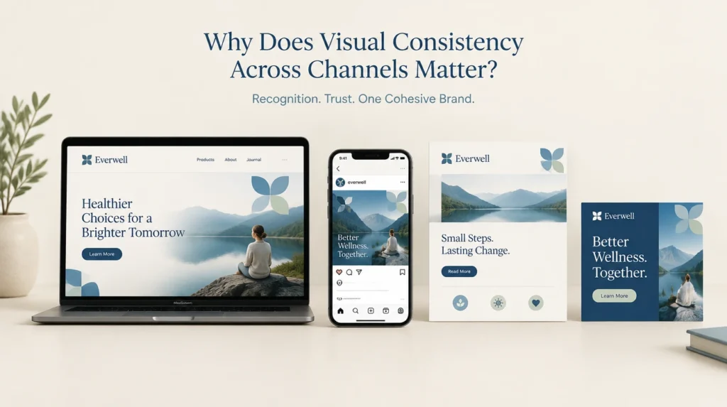
Visual consistency matters because recognition compounds into revenue, and inconsistency quietly breaks that. Research from Lucidpress and Demand Metric ties consistent brand presentation to a revenue lift of about 23%, with later studies putting it as high as 33%. Treat the figure as directional, since it comes from marketer surveys, but every version points the same way.
Here’s the gap most brands fall into. Only about 25% of companies with brand guidelines actually enforce them, which means roughly three in four own rules they don’t apply. The guideline exists. The consistency doesn’t. That’s revenue left sitting on the table for no reason other than discipline.
Consistency also feeds trust, and trust is doing more work than ever. Edelman found that 80% of people trust the brands they use, more than they trust most institutions. A brand that looks the same everywhere feels dependable. One that looks scattered makes buyers wonder what else is sloppy. And mismatched channels make your paid media work harder, because every ad has to reintroduce a brand the last touchpoint failed to establish.
How do you create a consistent visual identity in 6 steps?
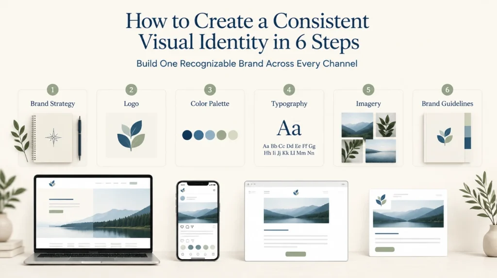
You build consistency by locking a core system first, then making the on-brand choice the easy one. The six steps below run in order, because you can’t be consistent to a system that doesn’t exist yet. Skip the foundation and every later step is guesswork.
Lock your core visual system first
Define the non-negotiables before anything else. Set your logo rules, a tight color palette with exact hex values, no more than two typefaces, and one clear image style. This is the thing everything else stays true to. Without a defined core, there’s nothing to be consistent to, so this step can’t be skipped.
Write a visual guide people will actually use
Put the system in a guide short enough that people read it. Include do and don’t examples, exact color codes, logo spacing, and font rules. A tight, specific guide beats a 60-page brand book nobody opens. The goal is a reference a new hire or freelancer can follow in ten minutes, not a trophy document.
Build a central asset library
Give everyone one place to grab approved logos, colors, fonts, and templates. When the right files are a click away, nobody rebuilds the logo from a screenshot or guesses a color. A shared drive or a simple digital asset manager works. The point is a single source of truth, so the brand doesn’t fork across teams.
Adapt per channel without breaking the core
Let the identity flex for each channel while the core holds. A website header, an Instagram grid, an email, and an ad all look different in format, but the color, type, and logo stay fixed. Plan how the system translates to each one up front, so adaptation is intentional rather than a designer guessing on deadline.
Make the on-brand path the easy path
Consistency fails when staying on brand is harder than going off it. Lock your brand kit in the tools your team actually uses, like Canva or Adobe Express, so the default output is already correct. When the easy button produces on-brand work, people stop improvising, and drift stops at the source.
Audit every channel on a schedule
Drift is slow, so catch it on a cadence. Every quarter, sweep your website, social profiles, email templates, and live ads against the guide. Fix what slipped before it spreads and becomes the new normal. We run these audits for clients and almost always find an old logo still live somewhere nobody thought to check.
Not sure how far your brand has drifted across channels? A benchmarked growth audit maps where your visual identity breaks down and what it’s costing you, using your own channels.
Book a growth auditWhich digital channels need to match, and how?
Your website, social profiles, email, and paid ads all need to share the same visual core, with each adapting only in format. The fixed parts, logo, color, and type, stay identical everywhere. The flexible parts, layout, crop, and copy length, bend to fit each channel’s shape and audience.
| Channel | Stays fixed | Adapts |
|---|---|---|
| Website | Logo, color, type, image style | Layout, section length, navigation |
| Social profiles | Logo, color, type, tone of visuals | Crop, format, post cadence |
| Logo, color, type, header style | Width, template, copy length | |
| Paid ads | Logo, color, type, core message | Aspect ratio, headline, offer |
One handoff matters more than the rest. The jump from a social ad to the landing page it clicks to. When the ad and the page don’t match, buyers feel the seam, trust dips, and conversions leak right at the moment of intent. Match that pair first.
How does visual identity connect to the rest of your brand?
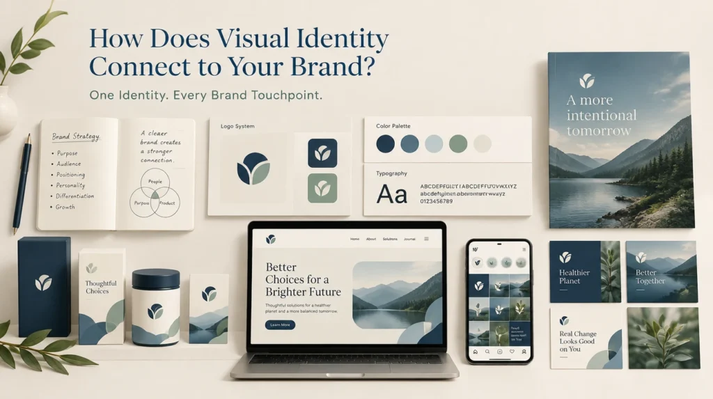
Visual identity sits inside a bigger system. Brand strategy decides what you stand for. Creative direction sets the overall look and feel. Visual identity is the system that keeps that look consistent everywhere. Performance media then spends against it, which is why consistency shows up in your ad costs.
At Morphiaas USA, a performance marketing agency serving businesses across the United States, we build the identity to hold up under real spend, not just in a brand book. Our brand strategy work defines the visual identity and the system that enforces it, and our creative design work makes it real across every asset. For the vision that sits above the system, our guide on what creative direction is and why it matters covers the layer identity expresses.
Frequently asked questions
What’s the difference between visual identity and brand identity?
Brand identity is the whole package: your name, values, voice, personality, and visuals. Visual identity is the visual part specifically, the logo, color, typography, and imagery. Visual identity is one component of brand identity, the part people see, while brand identity also covers how you sound and what you stand for.
How do I keep branding consistent with a small team?
Lean on systems, not willpower. A short visual guide, a central asset library, and locked brand kits in your design tools do most of the work, so staying on brand is the default rather than a decision. A small team stays consistent by making the right choice the easy one, not by remembering every rule.
Should my brand look exactly the same on every platform?
No, it should look consistent, not identical. The core system, logo, color, and type, stays fixed everywhere, but the format adapts to each platform. An Instagram post, an email, and a billboard all have different shapes and contexts. Consistency is about a recognizable core, not copy-pasting the same image everywhere.
What are brand guidelines and do I need them?
Brand guidelines are the written rules for how your brand looks and sounds: logo usage, colors, fonts, imagery, and tone. Yes, you need them, because without a written standard, consistency depends on memory and taste, which drift fast. Even a one-page guide beats nothing, as long as your team actually uses it.
How often should I audit my visual identity?
Audit quarterly as a baseline, and after any big change like a new campaign, a website update, or a new hire taking over design. A quarterly sweep of your website, social, email, and ads catches drift before it becomes the new normal. The goal is to fix small slips before they compound into a fragmented brand.
If your brand looks like a different company depending on where people find it, that’s fixable, and it’s worth real revenue. Get a benchmarked growth audit and a plan you keep whether or not we work together.
Get a benchmarked growth audit